This is the last week of the Summer Card Camp...it's been interesting and I've learned a few new things. Our color palette for this week is shown above...I love those colors and they immediately reminded me of the BEACH. And yep, I'm going in September with the whole "FAM" and I can't wait!!!
I made a card using a technique called Faux Letter Press demonstrated by Jennifer McGuire. You basically ink up an embossing folder and then run your folder and paper through your embossing machine. Jennifer also demonstrated inking on acetate which I'd done before (thanks to a class I took at CKU with her several years back). She does such beautiful work...such a stamping Queen!
Without further ado...here is my card:
For the Faux Letter Press technique I used Stampin' Up Bliss Blue ... the effect is that the dots are raised and white and the background is Bliss Blue. I also ran a Pearl Paint Dabber over the white dots to give it a little more sheen. This photo doesn't show up the Bliss Blue very well, but it's there. I also used StazOn Opaque ink (note to self: get a new pad!) with an Autumn Leaves swirl stamp. All paper was Bazzill Basics and the flower was Spare Parts from Hobby Lobby. The sentiment is from Paper Trey Ink Mat Stack 3 and was done with Color Box pigment ink and embossed with clear embossing powder. That's it! I like the effect and will probably do this again at some point.
Dying Seam Binding:
Creations with Christina had a tutorial this past Monday on dying seam binding. I ordered from the place Christina mentioned called SEW TRUE on Monday and received my shipment today! I thought that was really fast shipping! I followed Christina's tutorial and dyed these 4 pieces in less than 5 minutes...which included clean up time!
The 3 on the left were done with Stampin' Up Reinkers...the one on the right was done with Glimmer Mist.
I've left it on my craft mat to dry overnight. I think that is just a really inexpensive but fun alternative to ribbon!
Showing posts with label Summer Card Camp 2011. Show all posts
Saturday, July 23, 2011
Friday, July 15, 2011
Summer Card Camp 2011: Week 3: Card 1
So here is the card I made using a technique Jennifer McGuire demonstrated called "Finger Inking".
First I stamped on the smooth side of a piece of watercolor with Versamark. I put white embossing powder over and used my heat gun to melt it. Then I started the Finger Inking. Now Jennifer just used her inks and her fingers...my technique would more aptly be called Latex Glove Inking because I am a prima donna and don't like getting ink all over my hands so I put a glove on my hand! In the video we saw Jennifer's hands were just a mess at the end and I thought..."I DON'T WANT TO MY HANDS TO LOOK LIKE THAT!"
As Jennifer demonstrated I put some of the Ranger Distressed Inks on my craft mat and spritzed with water and then picked up some of the color with my latex covered finger tips and dabbed it on my stamped paper. I also added a little Perfect Pearls (Pearl) to the red ink for a bit of a sheen.
I added a few metallic dots to some of the flowers. I also used the flower stamp with Versamark on the dark brown card base to give it a watermark look.
It was really kind of fun to do...but I'm glad I used the glove!
Other supplies I used were:
Stampin Up Vintage Vogue
Twine from Archiver's
Hero Arts Metallic Decor
Woodmark USA "On Your Special Day" Sentiment
Friday, July 8, 2011
Not My Favorite Technique...
What am I talking about? I'm talking about a technique that was demonstrated in the online Card Camp class I'm taking. It was a technique by one of my favorite people in this wonderful world of stamping and paper crafting...Jennifer McGuire. I've taken classes with her before and have been wowed by the techniques she has taught. BUT NOT THIS ONE!
Anyway, here is my finished card:
I will say that when Jennifer demonstrated in her video her project came out looking pretty nice. It's basically a sort of reverse embossing technique where you "kiss" of some embossing powder (before it's melted, of course) with a stamp image. After several tries with several stamps I own I decided it's the kind of stamps I have....you really need stamps with large parts stamped out. That makes no sense, I realize that and I don't know exactly how to explain it but let me try again. Most of my images are line drawn so when you stamp with ink (say you use black) you get a line drawing of your image and then you can color in with paints or watercolors or inks or whatever. Those kinds of stamps do not work well for this technique. You need a larger area that if you were to stamp with a traditional ink would have a lot of ink on it. Know what I mean?
OK...here's a stamp set from Hero Arts. The stamp on the bottom left might work ok for this technique but the one on the top right would probably not do quite as well.
Basically what you do is you take your Versamark ink pad and just press it down (to leave a rectangle of Versamark) onto a piece of paper...Jennifer used watercolor paper and that's what I used as well. Then you sprinkle embossing powder on your ink on the paper....shake off the excess and THEN you get your stamp and ink it up with the Versamark and press it down onto your embossing powdered and what happens is the part of the image that has the ink on it will pick up the embossing powder off your paper as you "kiss" it. Got it? Then what you kind of have is a reversed embossed image. You melt the powder so the image is sort of framed by the embossing powder but your image is actually NAKED. Then you can take watercolors, inks, whatever you want and color your image.
As I said...I think Jennifer's card came out beautifully but I think my problem was not having the right kind of stamp. I tried several but didn't get the look I wanted so did it with a Hero Arts sentiment stamp. After I got it embossed I painted it a few times with some Twinkling H20's I had on hand (which I had to have a few years back and rarely use!).
Anyway, the card is simple in design but took me forever to make! LOL! I embossed and embossed and embossed and embossed...I had a mess!!! But fear not...my nice clean room is clean once again!
To finish off this card I used Paper Trey Ink printed papers and cardstock, some Kraft cardstock I had, Swiss Dots embossing folder, Paper Trey Ink satin ribbon, and some buttons I have had on hand as well as a little twine.
I will say it was half fun to make but half aggravation, too. I don't know that I will do this again....
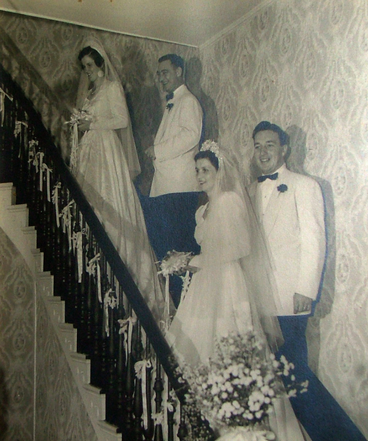
OH....and for those of you who saw my post yesterday about our trip to see my kids' grandmother I was able to get a picture of her wedding photo. The photo is actually sealed in a frame so could not be scanned...this isn't the best image but isn't it lovely. A.G. and N.B.G's great grandmother is on the top of the stairs and her sister is on the bottom. I just love this photo of these matching brides....don't you? I imagine it was taken in the mid 1940s.
Happy Crafting!
Monday, July 4, 2011
Summer Card Camp 2011: Week 2: Card 1
The new palette for Week 2 of the Summer Card Camp 2011 was released today for us to use to make a
card.
I had a little trouble deciding what to do...should I just use various paper, punches, stamps, inks? What to do...what to do... Sometimes the hardest part is getting started. Sometimes the ideas in the head do not compute to something worth a toot on paper! But sometimes it DOES all come together! :)
I decided I wanted to use this cute Margarita Moments stamp set by Unity which I bought recenlty but have never used. So that gave me a starting point but it took a while to decided a card design. This is what I came up with, though:
I thought it turned out rather cute...and once I figured out what I was going to do it didn't take long at all.I used my Mat Stack die from Paper Trey Ink and used one of the Mat Stack Collection 3 stamps and tucked it under the orangey cardstock strip. I stamped the margarita glass in black used some colored pencils to color it and used Gamsol to blend. I added a little glitter to the rim and some glossy accents to make it nice and shiny! I stamped the sentiment on the bottom with Versamark and then used some Ultra Detail White Embossing Powder with my heat gun.
The supplies I used...and YES...everything I used I had on hand...included:
Hero Arts Sunshine Layering Paper
Artist's Loft pencils/Gamsol
Versamark
Ultra Detail Embossing Powder
Ribbon: Michaels
Hero Arts Poppy Chalk Ink
VersaFine Onyx ink
Hero Hues Flowers
Crystal Stickers-Orange
I think it's a nice happy little card. And it makes me thirsty for a nice frozen salt on the rim 'rita! Yum!
Thursday, June 30, 2011
Summer Card Camp 2011: Week 1: Card 2
In the Summer Card Camp 2011 we also learned a cool technique to make a window card with acetate. Jennifer McGuire did a really pretty one for a demonstration. And here is mine:
I love that Cricut has many window cards on various cartridges and I make them often. This time however I did it a different way using the Nestabilities Scalloped Circle and my Cuttlebug. I thought it would be easy to cut out...well, I should have done a regular circle...the scallop was actually difficult to line up and I sort of went through a few sheets of white paper...and a few scrap pieces of my pretty printed papers. But it finally worked and I got it done!
Besides the Nestabilities I used Doodlebug Petite Prints, Bazzill cardstock and BoBunny Punch Dot papers. I am not sure what the cute stamp set I used is from but I think it's an Itty Bitty set from Unity Stamps...I know it is made by Unity Stamps but I'm not sure what the name of it is. I recently purchased Gazpacho Soup by Unity from Crafty Steals and this came with it but was packaged separately. Anyway, it's a cute bathing suit and fun sentiment and it's what I chose to use.
I also used some Offray ribbon and a Hero Arts Gem. I used Stampin' Up Markers and ink as well. All the challenge colors are there...the inside is actually lined with the sky blue print and the sentiment is mounted with purple. It's all there...I promise!
It was fun...but again...it took me much longer than I thought it would. I think I might do a few more of these but use the smooth edged circle to speed things up. There is probably a simple way to using the scalloped die...I just couldn't figure it out! :)
Happy Crafting!
I had seen a card where the window was off center and that appealed to me as a something different for me to try. Jennifer used acetate on hers to make a window but I didn't want that affect for this card so left it off. I've done that before, though...and stamped on the acetate which is fun to do, too.
I love that Cricut has many window cards on various cartridges and I make them often. This time however I did it a different way using the Nestabilities Scalloped Circle and my Cuttlebug. I thought it would be easy to cut out...well, I should have done a regular circle...the scallop was actually difficult to line up and I sort of went through a few sheets of white paper...and a few scrap pieces of my pretty printed papers. But it finally worked and I got it done!
Besides the Nestabilities I used Doodlebug Petite Prints, Bazzill cardstock and BoBunny Punch Dot papers. I am not sure what the cute stamp set I used is from but I think it's an Itty Bitty set from Unity Stamps...I know it is made by Unity Stamps but I'm not sure what the name of it is. I recently purchased Gazpacho Soup by Unity from Crafty Steals and this came with it but was packaged separately. Anyway, it's a cute bathing suit and fun sentiment and it's what I chose to use.
I also used some Offray ribbon and a Hero Arts Gem. I used Stampin' Up Markers and ink as well. All the challenge colors are there...the inside is actually lined with the sky blue print and the sentiment is mounted with purple. It's all there...I promise!
It was fun...but again...it took me much longer than I thought it would. I think I might do a few more of these but use the smooth edged circle to speed things up. There is probably a simple way to using the scalloped die...I just couldn't figure it out! :)
Happy Crafting!
Wednesday, June 29, 2011
Summer Card Camp 2011: Week 1: Card 1
As the little graphic above suggests...I am participating in a Summer Card Class taught by Kristina Werner and Jennifer McGuire. Our color palette for week 1 is shown above...a purple, a pink, a sky blue, an orange and a white. I love these very summery colors and thought it would be fun to come up with something.
OK...changing the subject sort of...when I see the colors on my computer they look one way...when I print them out they look another way...and when I viewed them on my iPhone they looked yet another shade of those colors! That was a bit aggravating so really, when I chose my papers and pretty things I wanted to use I just went with the colors as I thought they were supposed to be. So if they look off...well, that's just the way they are! :)
Anyway, here's my card:
I don't ordinarily stamp and color...just not usually my thing but I bought some Gamsol (odorless mineral spirits and a blending stub) a couple of months back and thought it would be fun to color. Well, great...I could find the Gamsol but I couldn't find the colored pencils I wanted to use. I found watercolor pencil after watercolor pencil but couldn't find the regular pencils I know I have! Oh well...I pulled out the zillions of markers I have and stamped this cute little girl image. I colored her in, added some Glossy Accents to the flowers and her bows and FOR ONCE I did not touch it before it was dry. I usually cannot resist touching it to check it and of course I end up with a huge mess!
I used pink and purple Bazzill papers (including the pink Double Dot paper), white cardstock, a strip of blue that was colored with a marker and run through a crimper.
Besides the Bazzill paper I used:
Stampendous Cling Posie Picker Set (Stamp)
VersaFine ink (onyx)
Glossy Accents
Stampin' Up Grosgrain Ribbon
Stampin' Up Border Punch
Stampin' Up Writer Pens
American Craft Stamp Markers
Fiskars Crimper
Glue Dots, Zig 2 Way Glue, and my ATG adhesive.
And the colors are pinker and purpler than they look in the photo. It was fun to do!
OK...changing the subject sort of...when I see the colors on my computer they look one way...when I print them out they look another way...and when I viewed them on my iPhone they looked yet another shade of those colors! That was a bit aggravating so really, when I chose my papers and pretty things I wanted to use I just went with the colors as I thought they were supposed to be. So if they look off...well, that's just the way they are! :)
Anyway, here's my card:
I used pink and purple Bazzill papers (including the pink Double Dot paper), white cardstock, a strip of blue that was colored with a marker and run through a crimper.
Besides the Bazzill paper I used:
Stampendous Cling Posie Picker Set (Stamp)
VersaFine ink (onyx)
Glossy Accents
Stampin' Up Grosgrain Ribbon
Stampin' Up Border Punch
Stampin' Up Writer Pens
American Craft Stamp Markers
Fiskars Crimper
Glue Dots, Zig 2 Way Glue, and my ATG adhesive.
And the colors are pinker and purpler than they look in the photo. It was fun to do!
Subscribe to:
Posts (Atom)