What was so exciting to me was that I bought a these adorable digital hand drawn images from Shanna Vineyard HERE. The name of the kit is Home Is Where the Heart Is. I was really excited because I thought they were oh-so-cute and I loved her samples on her blog where she had done a digital layout as well as one where she had printed out the images on cardstock and then fussy cut them out. I decided to see if I could simplify the process a bit with my SILHOUETTE! Yep...all of these were printed on my home printer and then I was able to cut them out with my lovely Cameo. and it really was not difficult at all. I am a big fan of stamps and coordinating dies and I got this same look but in a much less labor intensive way. I simple pulled the png file into my Silhouette software, traced it, and then created a white edging around the image for the cut line. It was sooooo easy. And actually I did a layout on a yellow background and just didn't like it (wish I'd taken a picture for comparison) and redid it on this Jillibean black dotted paper. As I was redoing it I resized my images. That was the other great thing...I can use all of these images again and again and again at any size I'd like!
This layout only took me about 8 hours to complete...you know how fast I am (!)...the next one should be faster now that I know what I'm doing! LOL!
Look how cute these images are. Shanna did them so they look textured and then I printed on Colorbok textured cardstock which cut like BUTTAH on my Silhouette. Look how wonderful those cut edges look...very smooth...perfect cuts!
It looks like I drew them and colored them myself!
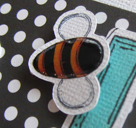
I added some Glossy Accents to some or parts of the images:
I really had a great time figuring out how to do this and it really opens up some possibilities for me....that is being able to pull in .png, jpeg, etc files to print and cut. The Silhouette is just so smart!
Happy Crafting...I'm hoping to get an hour of tennis in before it rains!


The images are wonderful with the photo layout. Especially liking the BEE.
ReplyDeleteMelissa
"Sunshine HoneyBee"
Great layout- love the little images- they add alot to the layout! :)Amy
ReplyDeleteYou did a BEAUTIFUL JOB, congratulations on figuring it out yourself. What a confidence booster. VERY NICE.
ReplyDeleteSandy
ohhhhhhhh great layout and love the litte details. cherry
ReplyDeleteYou truly carry the family creative genes!
ReplyDeleteI think we all do, sis...we all have our thing! I kill silk flowers! :)
ReplyDelete